Writing
Dashboards Answer Questions You Already Knew to Ask
June 3, 2026
This is part 1 of a 3 part series on data analysis and the changing role of the analyst with LLMs in the mix.
Non-alcoholic (NA) beer has been on a little bit of a bender, set to be the second most popular beer category overtaking ale later this year. The NA category is set to grow by 9% this year even as the entire beer category is set to shrink. There is an obvious shift where consumers are choosing NA and low-alcohol drinks.
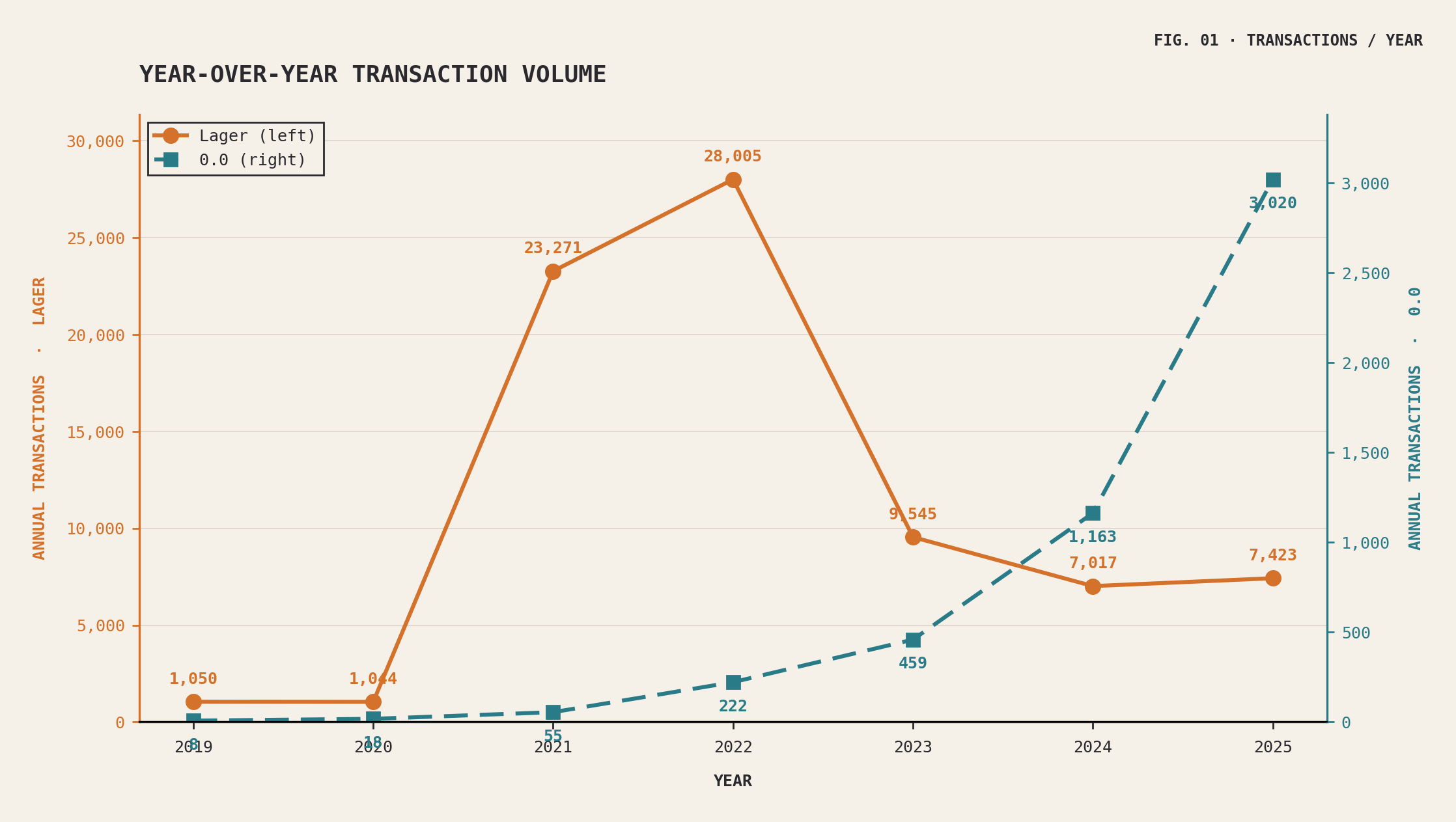
A few months ago I built a dashboard for a major beer brand. Two clean trend lines: the flagship lager drifting down from its post-pandemic peak, and its alcohol-free sibling — the 0.0 — climbing fast. Roughly five times bigger than it had been two years earlier. Inline with the larger global trends seen on other brands.
Naturally our suggestions would be to focus the marketing efforts where the consumer was heading. Our charts were accurate. The conclusion everyone drew from it was not.
The 0.0 is eating the lager, the room agreed. Of course it is — people are cutting back, the alcohol-free thing is real, the cannibalization was always coming. Makes sense. It also happened to be wrong, and no amount of staring at that dashboard would ever have told us so.
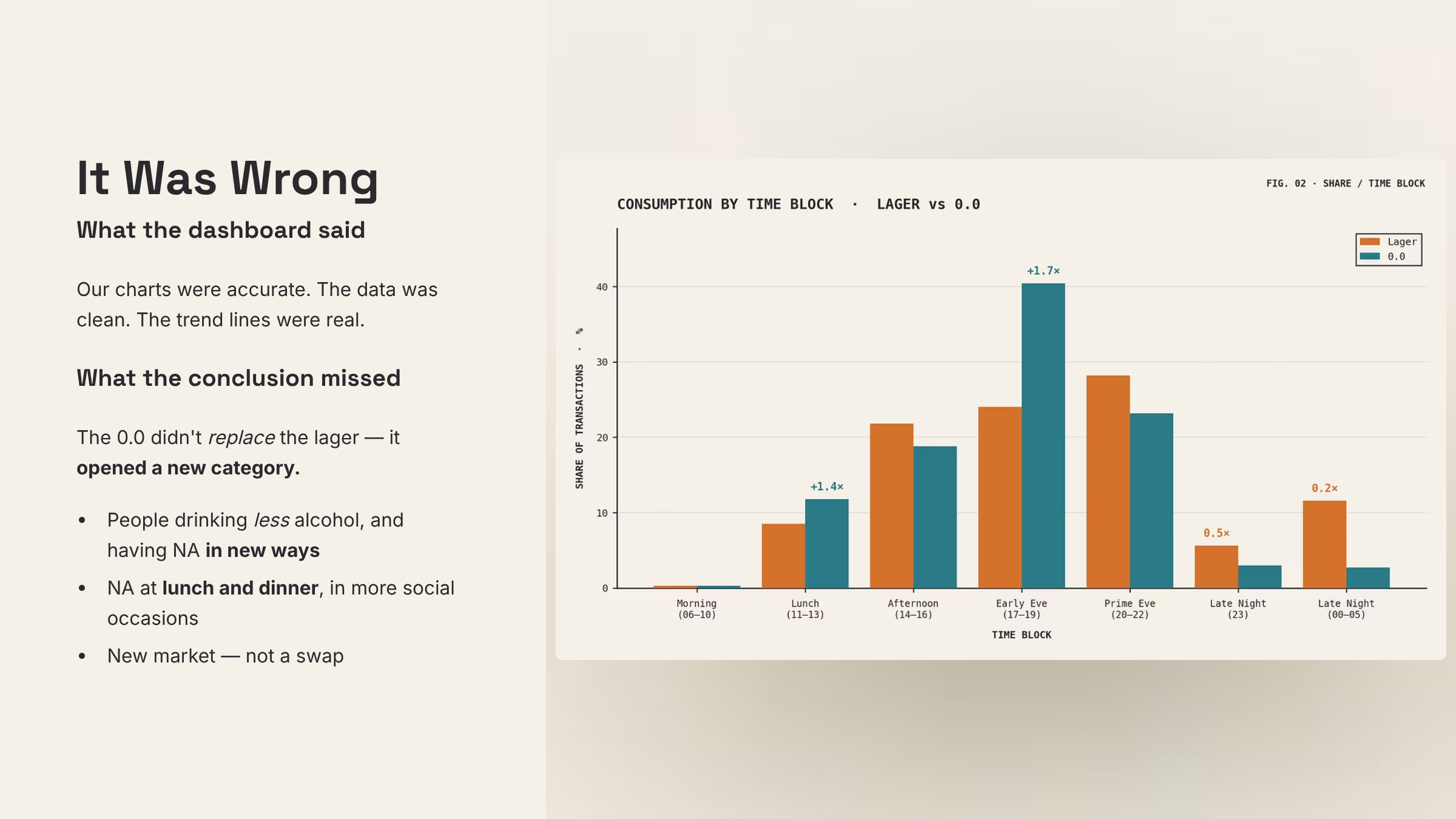
After some analysis, the 0.0 wasn’t replacing the lager, it was opening a new category. People weren’t replacing their alcohol with the NA brand, instead they were drinking less and having the NA brand in new ways.
They were drinking NA with lunch and dinner, in more social occasions. So instead of cannibalizing the alcohol portion, it introduced a new market.
The shift from marketing 0.0 as an alcohol-replacement was wrong, you would get a much more effective marketing spend if you positioned 0.0 as something for lunch/dinner and light social occasions, those times when alcohol is absent.
The assumption that NA is a replacement for alcohol drinks is not shown in the data, but without that deep analysis you never would have found it.
The dashboard could only show what we’d already thought to plot: two products, one axis, time. It answered the question we walked in with. It had no way to answer the question we didn’t know to ask, which turned out to be the only one that mattered. Dashboards are good at answering the how and what is in the data, but the why requires a different look.
What the dashboard was actually for
Usual data stacks are quite good at what they do. They ingest, clean and process data. Databricks and Snowflake have done a ton of good work here, and the tools are mature and established.
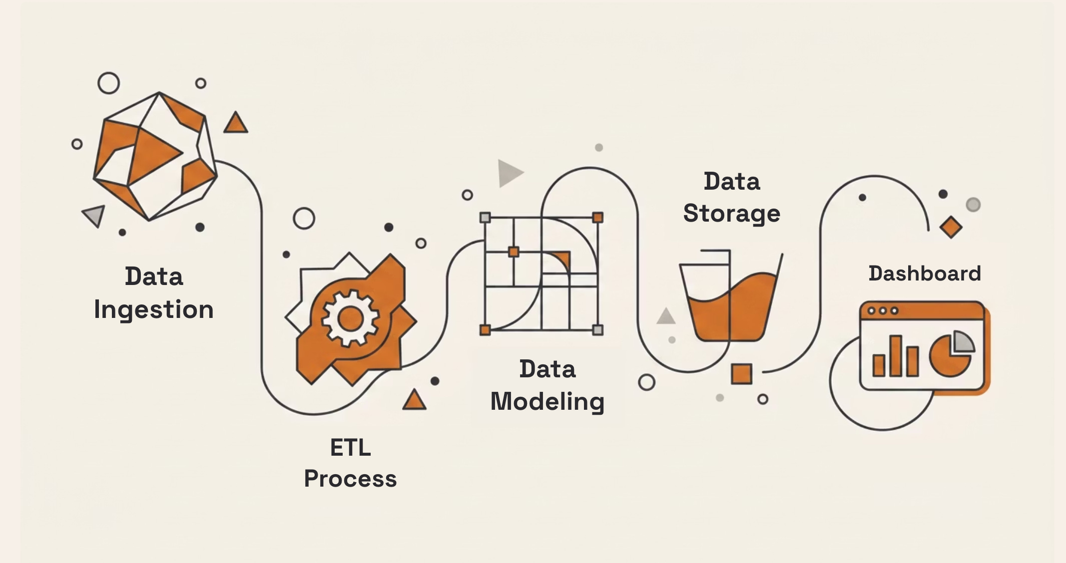
The canonical pipeline goes: source → ingest → warehouse → semantic model → BI tool → dashboard.
Each stage exists for a good reason. The warehouse gives you one place where the numbers agree. The semantic model encodes what “revenue” and “active customer” actually mean so that two people asking the same question get the same answer. The BI tool turns a query into a picture a human can scan in two seconds. This is not bad technology. For a particular shape of problem it is exactly right.
But look at what it optimizes for, the stack is built for repeated questions — you design a dashboard once and look at it every Monday. It’s built for numeric answers — the output is a measure, a count, a rate, a thing you can put on a Y-axis. And it’s built around human eyeballs as the synthesis step — the actual act of understanding happens when a person looks at the grid and notices something. The pipeline’s job ends at rendering. An analysts job starts here, and it’s far more than just a dashboard.
Dashboards expire quickly
To a statistical significance, nobody uses dashboards. Gartner has had self-service BI adoption stuck below 20% for years — meaning four out of five people the dashboards were built for don’t use them. One $400M retailer I read about spent $2.1 million on an AI-powered BI platform and got 11% adoption eighteen months later. Another company rolled a tool out to a hundred people and watched five of them actually use it; the rest found it overwhelming and went back to Excel. There’s a line from that research I keep coming back to: people revert to spreadsheets because Excel may be wrong, but at least it’s their wrong.
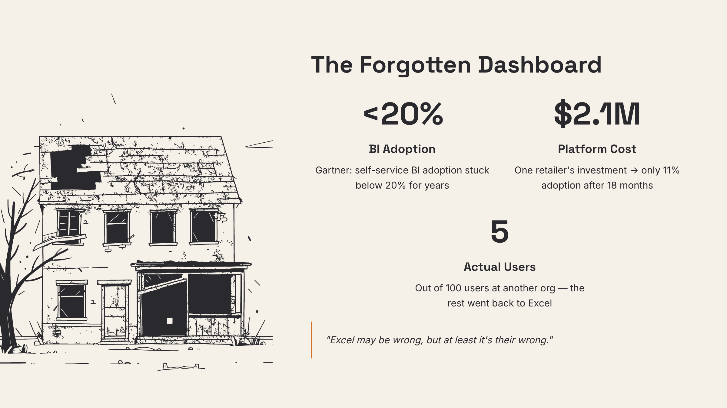
That’s not a tooling failure. You can’t fix an 11% adoption rate with a nicer chart library. It’s a structural mismatch between what dashboards are good at and what people actually need from their data, and it’s been hiding in plain sight because we kept blaming the rollout instead of the premise.
So if the outcome of the data pipeline is to produce a dashboard that nobody references, are we really benefitting from all that work.
Data, processing, understanding
Here’s the reframe. It’s not a replacement for the stack above — it’s a peer to it, a second pipeline that runs alongside the first and terminates somewhere completely different.
The old pipeline ends in a chart. This one ends in an explanation, a recommendation, or a surfaced anomaly with its context attached. The synthesis — the part where data becomes understanding — doesn’t happen in a human’s visual cortex scanning a grid. It happens upstream, in code and models, before anything reaches a person. By the time it reaches you, the noticing has already been done.
I’ve started calling the synthesis tier the understanding layer, and the test for whether you’ve actually built one is simple: it can answer why, not just what. A dashboard tells you sales dropped 8% in the Southwest last month. That’s a what. An understanding layer tells you sales dropped 8% in the Southwest, here are the three store-manager notes that explain it, here’s the residual that flagged it two weeks before the monthly review, and here’s the one store bucking the trend and what it’s doing differently. That’s a why. The difference between those two outputs is the difference between a tool you check and a tool that tells you something.
The reason this is possible now and wasn’t five years ago is that “understanding” used to require a human in the loop by definition. The machine could compute; the person had to interpret. That boundary moved. We can now do a meaningful slice of the interpretation in software — not all of it, and there are real limits I’ll cover in the next two pieces — but enough that ending the pipeline at a chart looks increasingly like stopping one step early.
Dashboard-worthy vs. insight-worthy
Before you go anywhere near building one of these, the rubric — because it’s the decision that actually changes your Monday.
Some questions are dashboard-worthy. They’re recurring (you’ll ask the same thing every week), they have a known answer shape (you know it’s a number on an axis before you see it), they’re regulated or audited (you need the same defensible answer every time), or they’re operational monitoring (is the thing up, is the number inside its band). For these, a dashboard is not a compromise — it’s the right tool, and the understanding layer would be overkill and less trustworthy. Keep your dashboards here. Make them excellent.
Other questions are insight-worthy. They’re ambiguous (you don’t yet know what shape the answer takes), exploratory (you’re hunting, not monitoring), they require fusing context from structured and unstructured sources, or they’re asked once — or asked so rarely and so expensively that building a dashboard for it never made sense.
“Is the 0.0 cannibalizing the lager?” is the purest insight-worthy question I can give you: ambiguous, one-off, needs three kinds of data fused, and catastrophic to get wrong. It was never going to be answered by a chart, and the eighteen months that beverage team would have spent looking at the wrong chart is exactly the cost of getting the routing wrong.
This is, I think, the genuinely useful reframe, and it lines up with where the better analytics vendors have landed too: dashboards and conversational, exploratory tools are complementary, not rivals. Dashboards for the standardized and the recurring. The understanding layer for the ambiguous and the expensive. The mistake of the last decade wasn’t building dashboards. It was building them for questions that were never dashboard-worthy and then wondering why adoption sat at 11%.
What’s coming next
So if dashboards aren’t the right shape for why questions, what is?
The obvious move — and the one most teams reached for first — is to drop a language model into the analyst’s seat. Point it at the warehouse, let it write SQL, ask questions in English. That’s the subject of the next piece in this series, Don’t Put an LLM in the Analyst’s Seat, and the short version is: it has a specific and dangerous failure mode that’s worth understanding before you build anything else. The piece after that, Three Lenses and a Translator, walks through the architecture I actually run — three lenses for analysis plus one role for translation, with the beer brand as the worked example.
For now, the takeaway is the rubric. Dashboard-worthy or insight-worthy. Most teams have been forcing the second kind through tooling built for the first. That’s the misfit. The next pieces are about what to build instead.
Originally published on Discontinuity